Next Gen Design Language
De-Constructing Design
Why surfaces are important to your Design Language.
As designers we need to make meaning of our design systems. This has led us to use different methods, techniques, and styles, with the goal of creating an intuitive information & interaction space. Perhaps its because we are exceptional at visual processing, or we have a need to represent things that our bodies can touch, (or maybe I'm biased because of my architectural background) - but we expect certain types of surfaces to exist in our interfaces.
In planning the next iteration of the Imerj phone, I identified a need to continue to evolve the current design language. In order to get there, I went back to basics.
For any project I embark on, I tend to start with a visioning step. This is the time I get to be hands on, to touch the tools, and the elements, and get back to the craft. By spending this time exploring the problem I can then better articulate the scope, and help frame the direction that must be taken.
Through this visioning step, often I take a strong point of view.
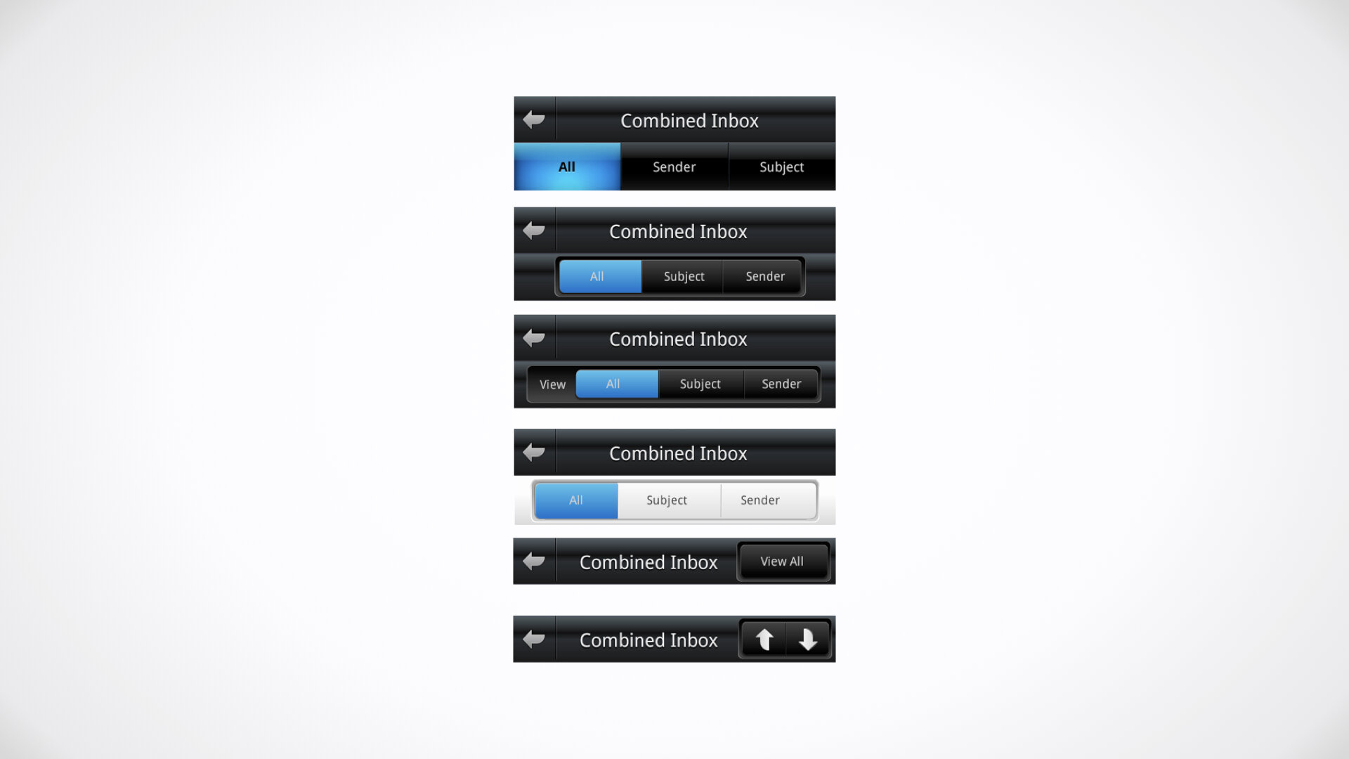
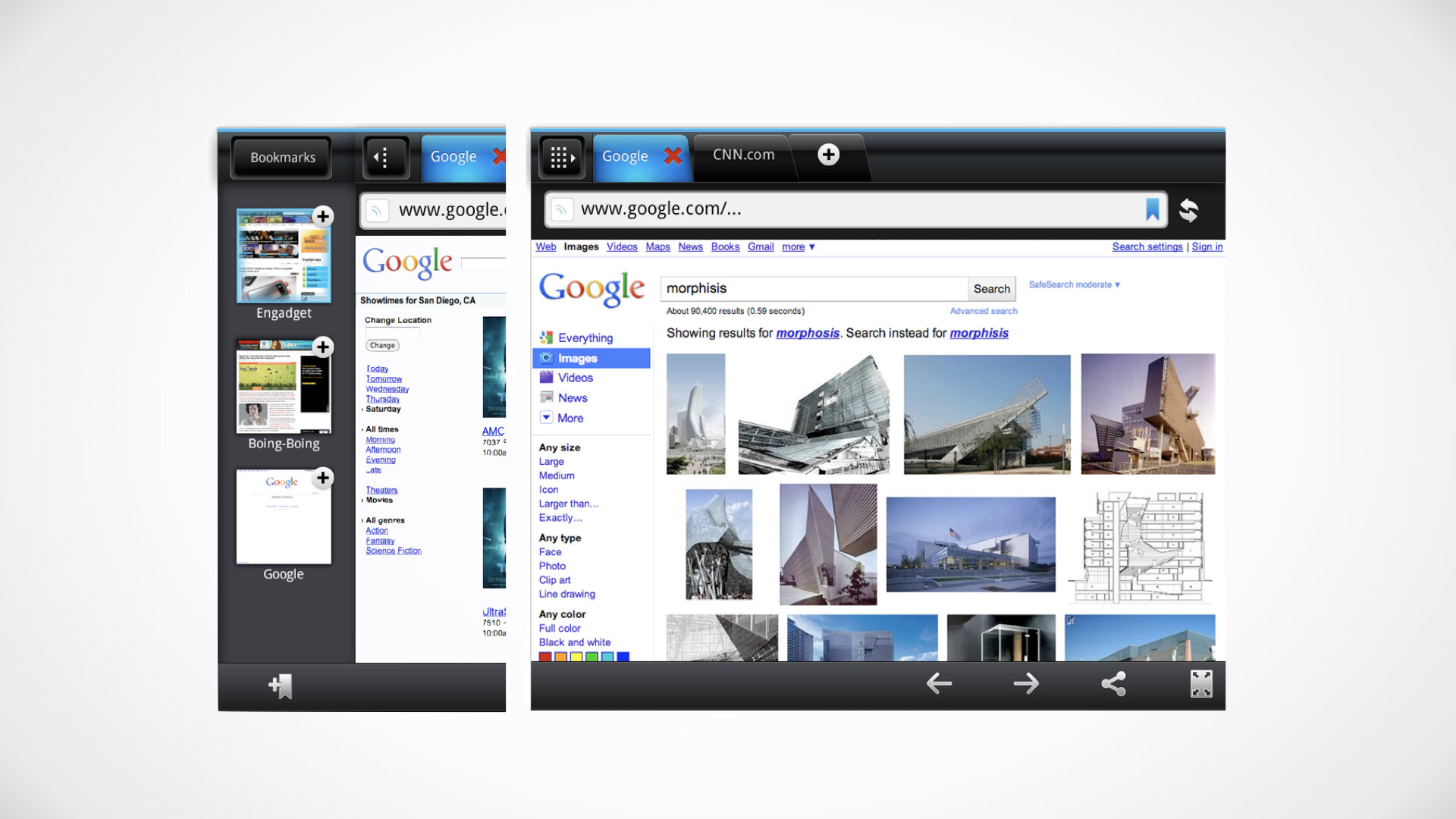
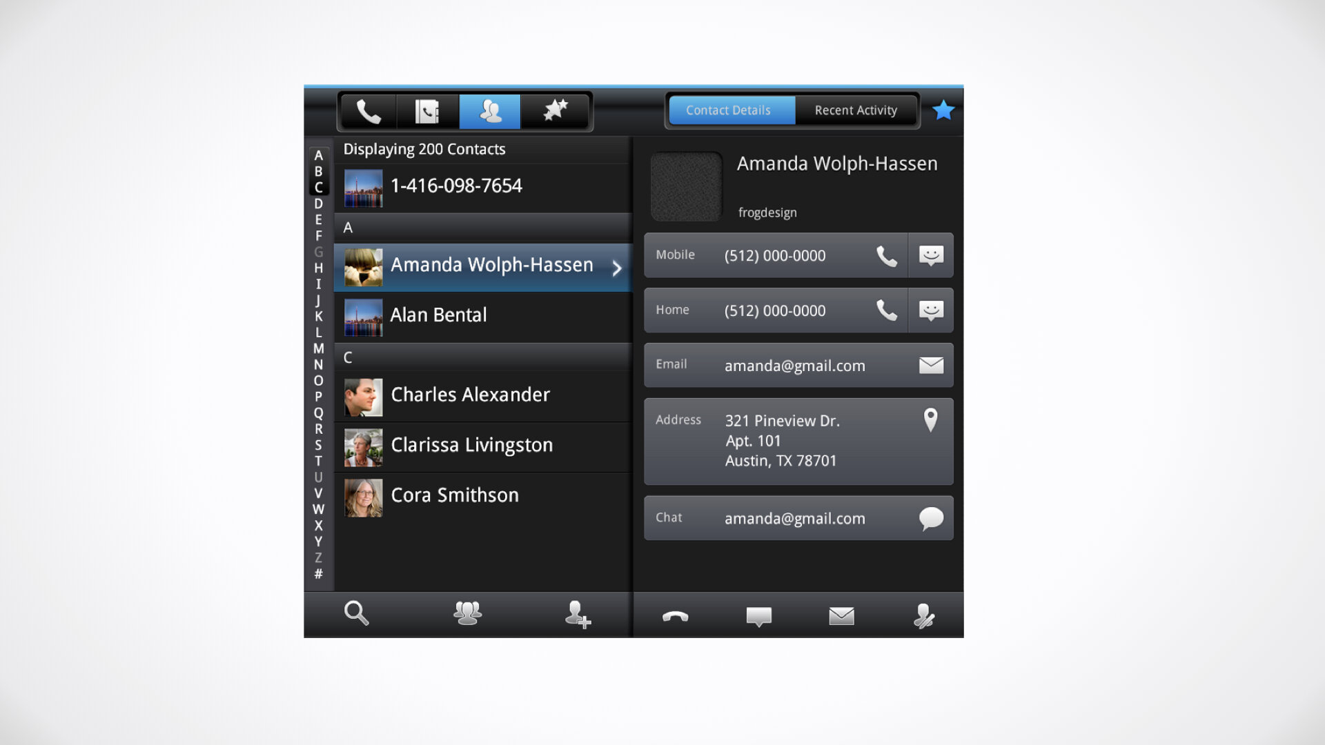
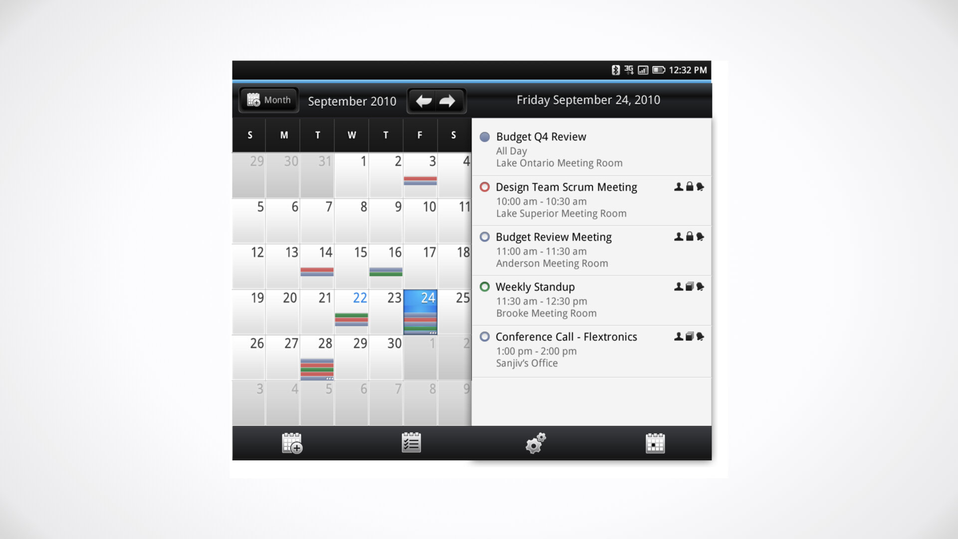
This was the approach I took on developing the next generation design language for dual screen applications. I examined all of the issues that couldn't be addressed in the current version, explored variations, and then created a clear framework from which design elaboration could start from.
Material before Material
Developing an OS wide UX/UI System isn't easy stuff. It is painstaking work that requires discipline, deep understanding of a user interfaces, tight collaboration between visual & interaction designers, and a framework mindset. Not to mention a general love of UI components and style elements.
Two things I spend time having my designers work through are containers and surfaces. If a design language necessitates structure - then these are the tools that assist.
Surfaces
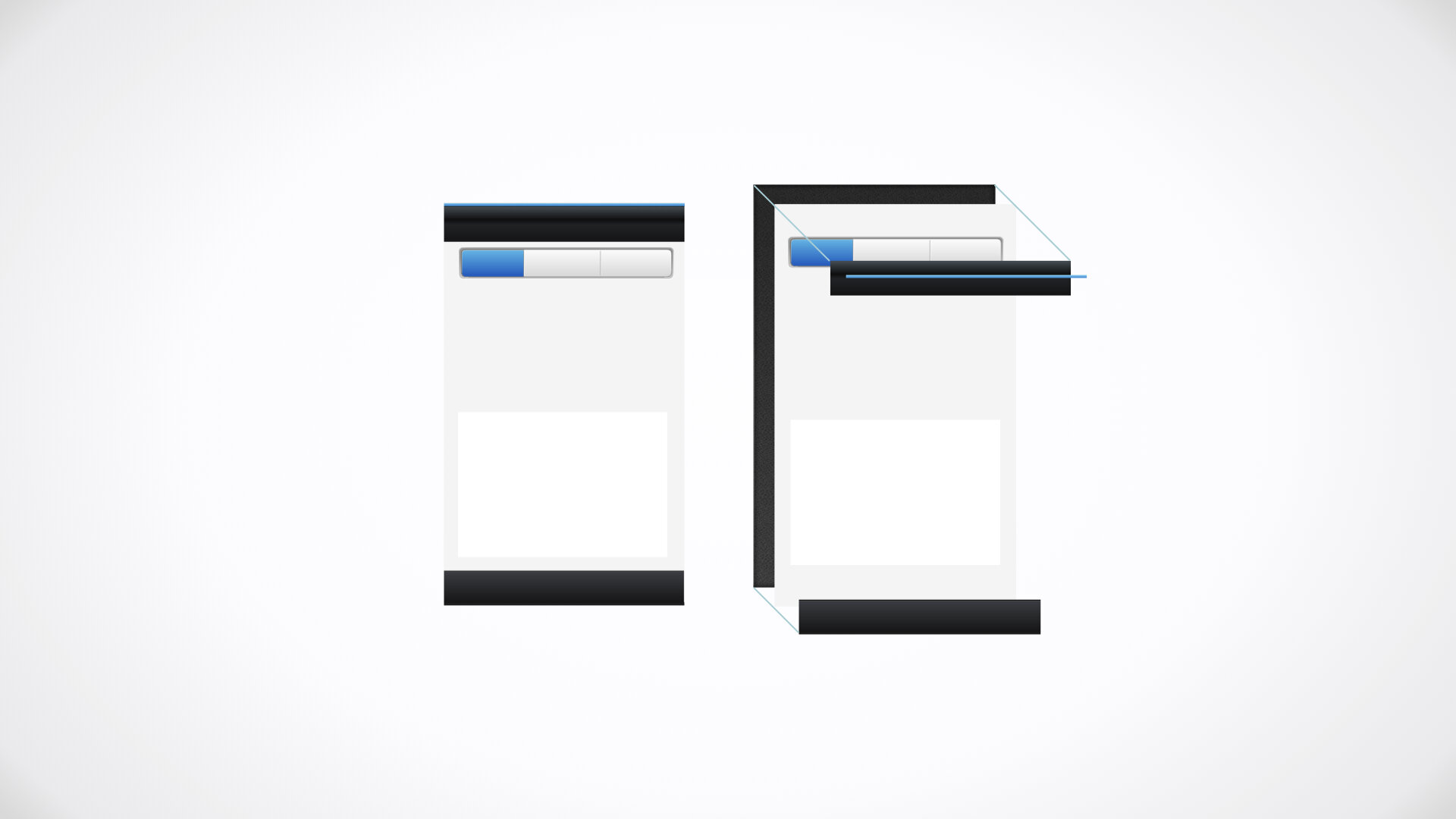
As in architecture - surfaces are used to define, support, guide and frame structures and containers. Whether you take a skeuomorphic or flat approach (or some other stylistic approach), I believe a mature design system must attempt to build relationships of surfaces across the Z dimension.
Googles Material design takes great pain to articulate this in their 'new' theme. Something which has been happening for decades with Apple & Microsoft - but more on that another day.
Surfaces and how they are separated from each other help create a visual system that reinforces information hierarchies and their corresponding interaction & motion cues.
Containers
Any given object that is positioned in space - be it a physical or digital space - has a relationship between the structure and it's content. Most designers tend to focus on the content, and then chip away at the containers that hold it together.
The best approach is to identify the purpose of containers before addressing content. Each container has an implied set of rules around its usage, type of content it contains, and its relationship to other containers. Most times these rules are not explicitly captured.
Containers fuse both information organization & interaction patterns.
The Future of Surfaces
The trends in design, point to more dynamic surfaces, ones that inherit or transform the content around them. In the VR/AR world, real objects act as surfaces (go figure!). Digital interfaces that require abstract representation will always necessitate organization through layering systems. As long as this is true, surfaces will continue to be strong elements in any design system.
Concepts from 2011
