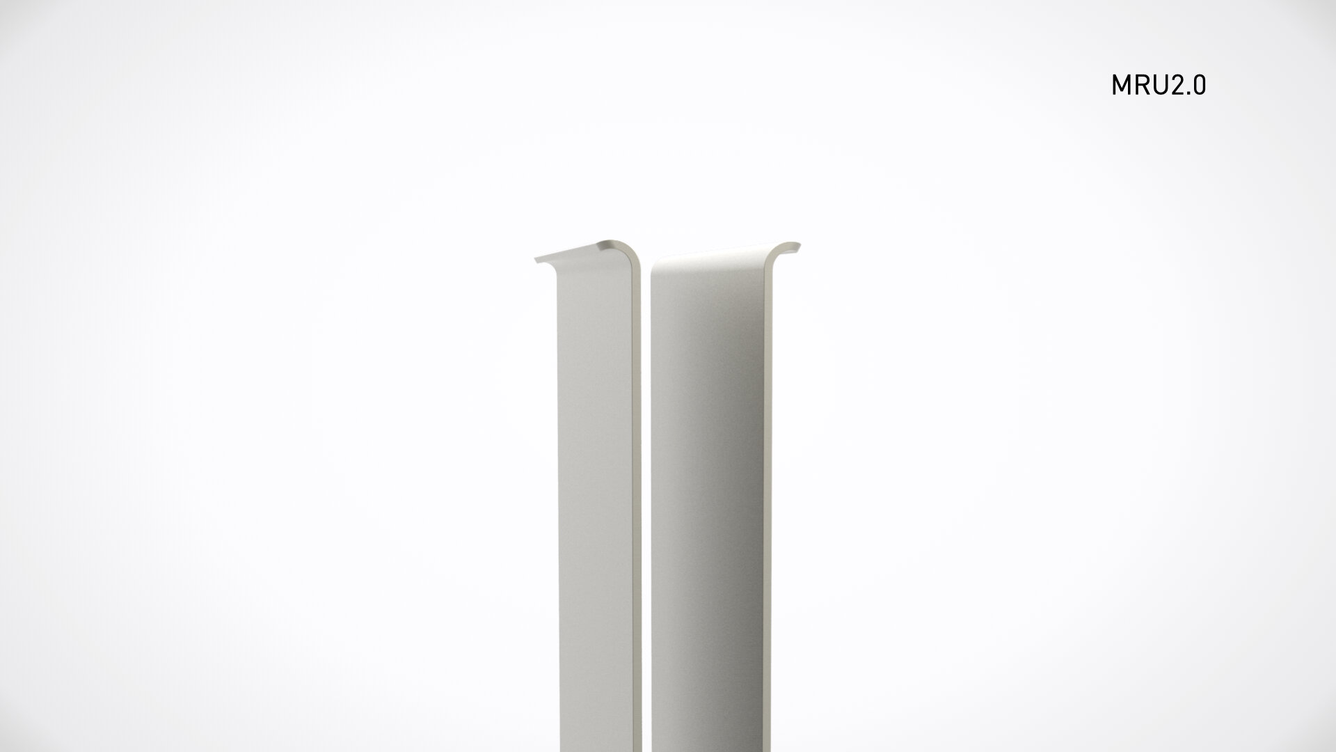
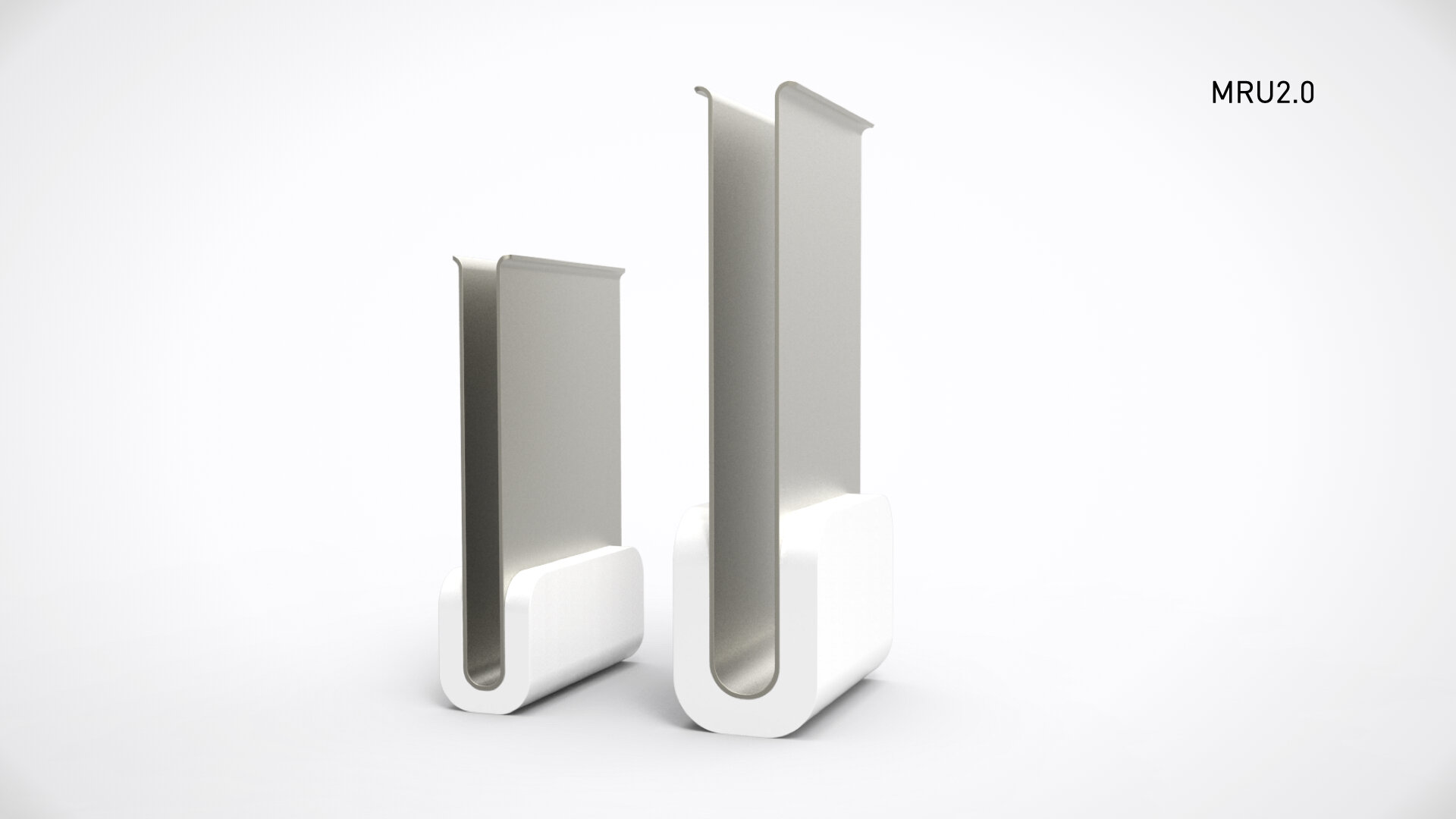
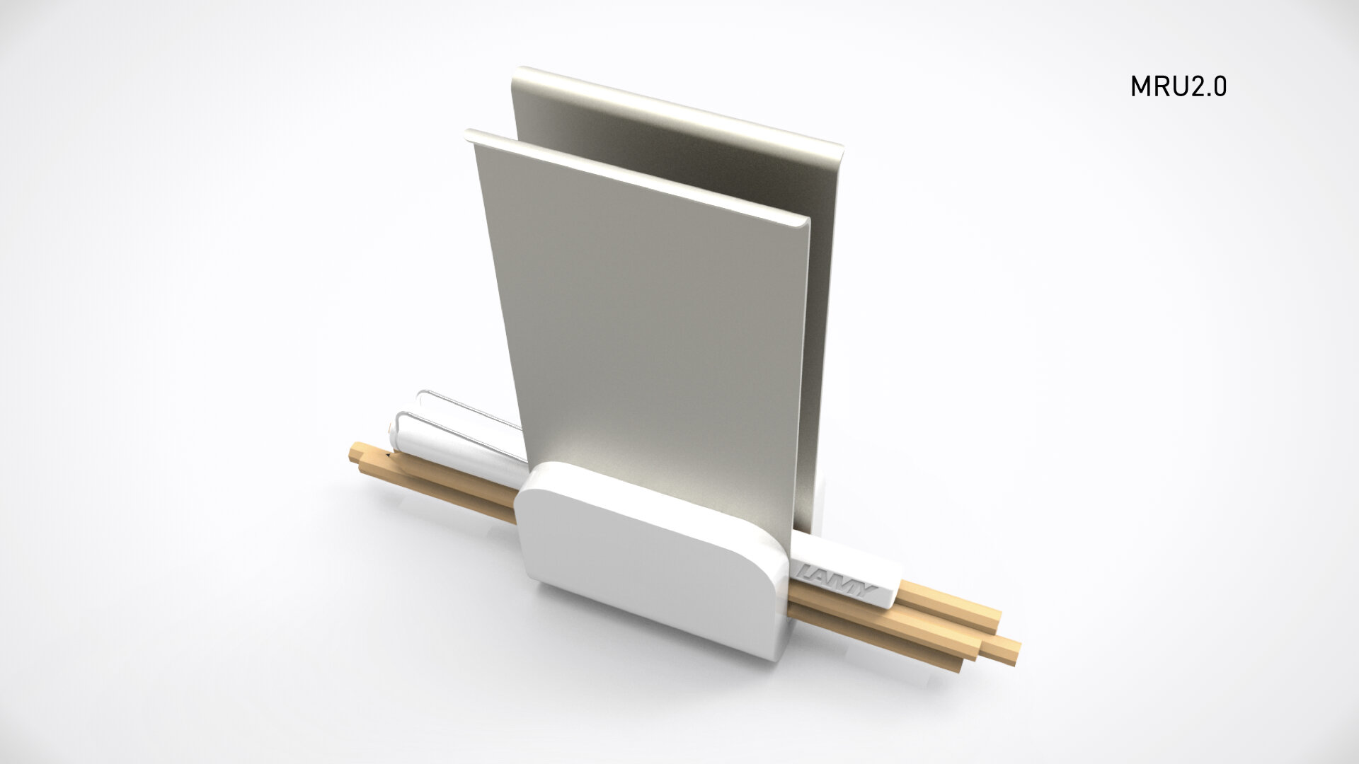
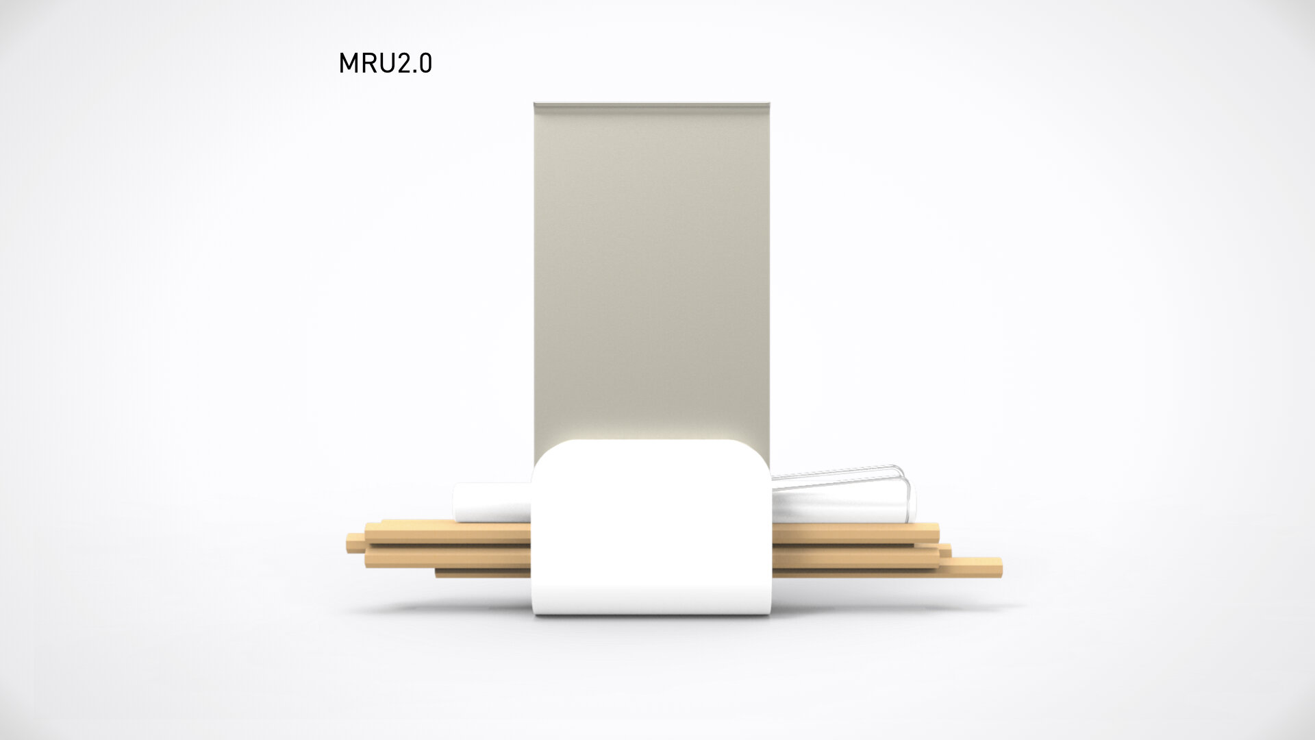
MRU: Modern Pen Stand
An Analog Design of a Digital UI pattern
All things interesting in my creative life happen by accident (I think this true for a lot of designers). This project started in a innocent way. I had a few plastic cards sitting at my desk which I had started to absently play with in my hands. You see, I was cleaning out my wallet, downsizing my loyalty memberships to thin out my wallet. I dont like carrying a thick wallet, opting for the front pocket hip style.
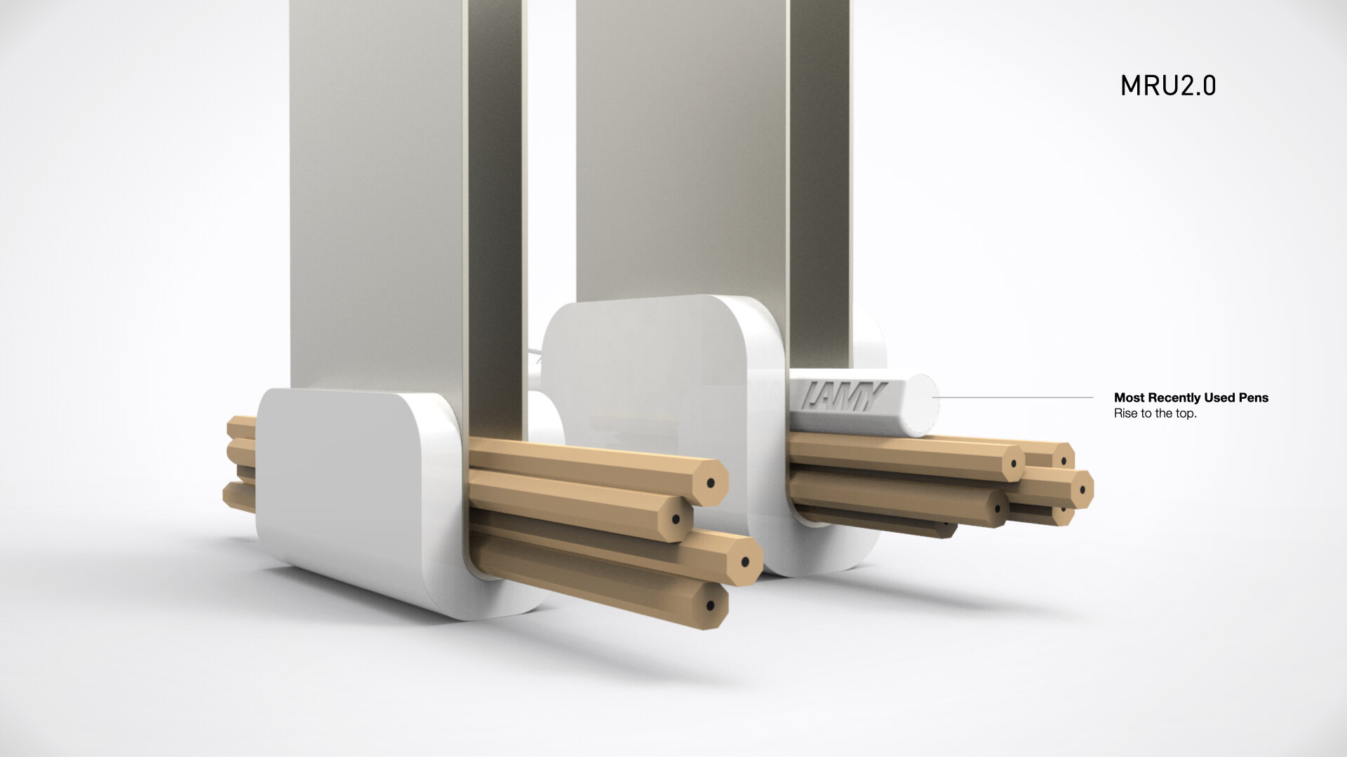
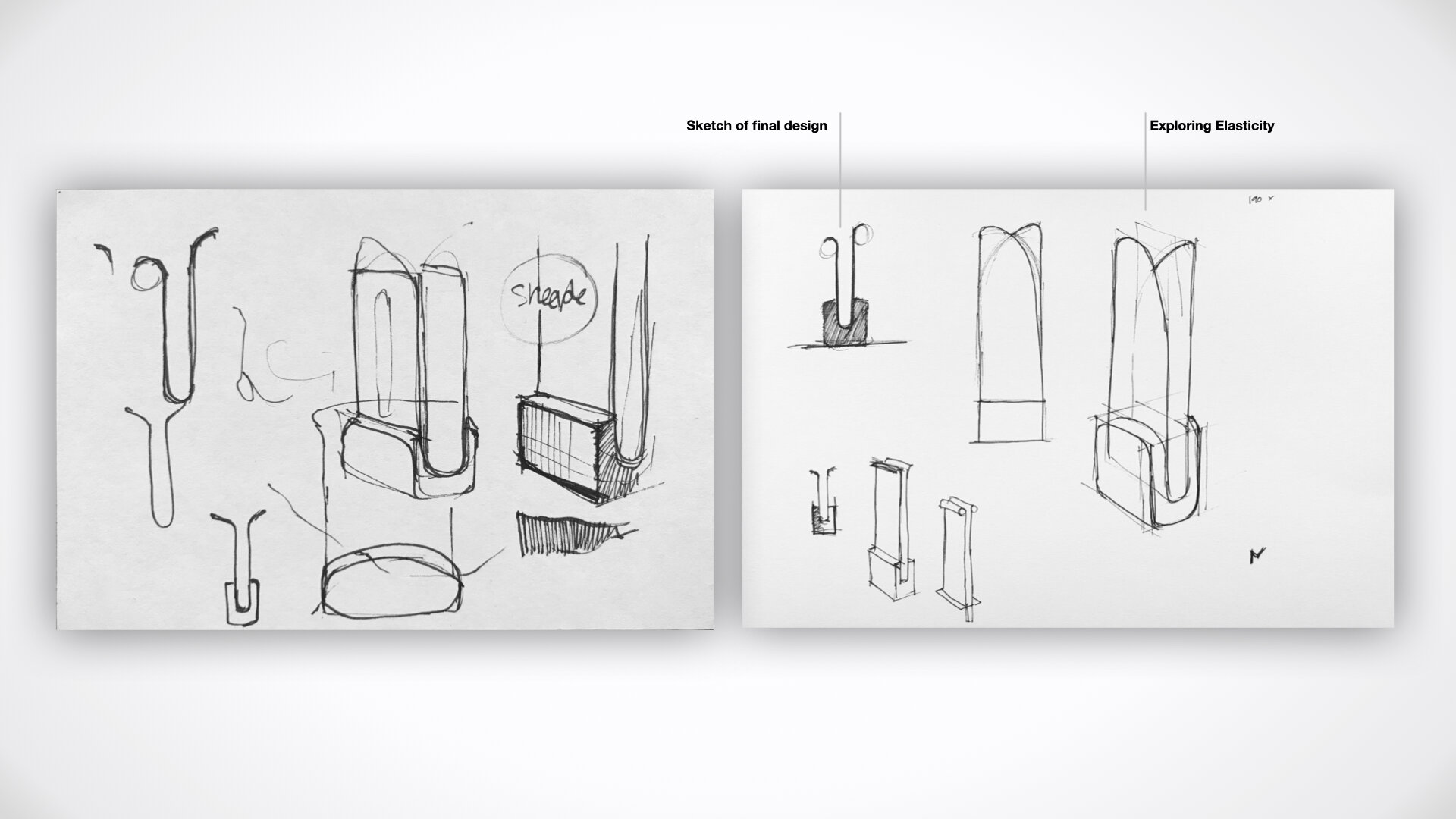
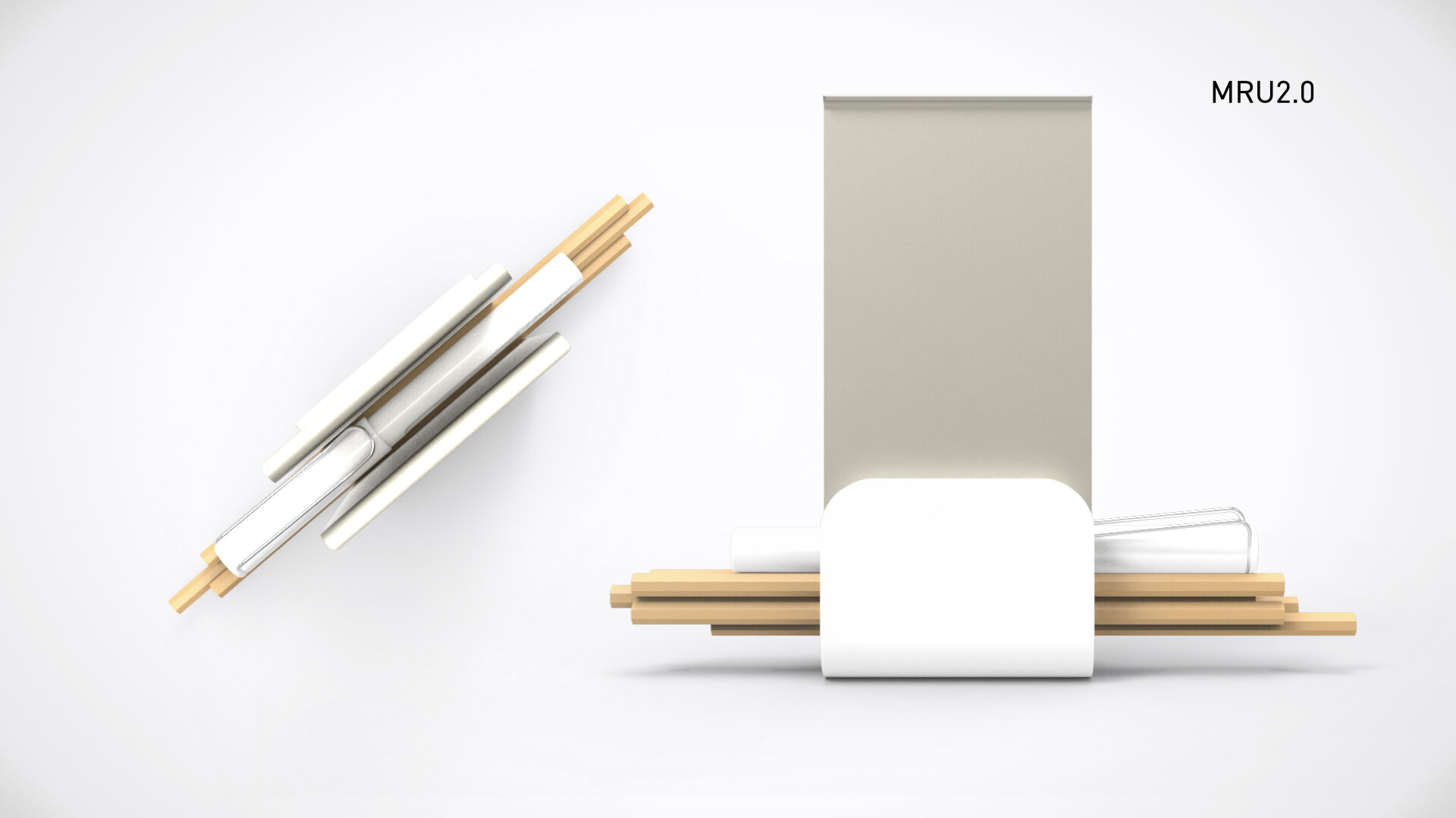
So between my Shoppers Drug Mart loyalty card, and my Lego VIP (really it's for my twin boys), I had an idea. I quickly grabbed two double AA batteries and some electrical tape and started to make. I sandwiched the batteries between the two cards, aligned the batteries at the bottom, and wrapped some electrical tape to form the first generation of the MRU.
I'm not sure at what point the idea actually cemented in my mind, but I had quickly created a working prototype. I knew pretty instinctively that I had the simplest idea needed to express its purpose. I took a snap of it and saved it for later.
It's later.
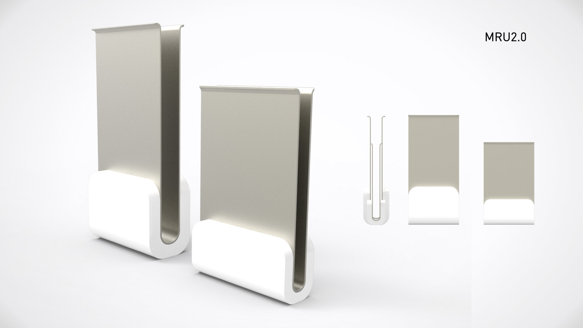
This must have happened about a year ago, and I knew that at some point I would polish it off and craft an elegant industrial design (I was really looked forward to that!). I'm rather fond of creating simple solutions to nascent problems. Even if they're not really meant to be built for mass production. A design excercise to stretch old muscles, and build new ones.
In the back of mind, I knew that this was a Physical manifestation of a Digital construct - a common UI pattern made real. (That's the biggest hint I can give to what it is) and maybe even create a physical prototype. In my life as a Designer, I'm always exploring, and creating new solutions for existing needs.
MRU
An MRU, commonly refers to "Most Recently Used". The earliest application I remember, was when I was designing a variation of the Drop Down List box for the Common UI team while I was working at Corel (early days in my career). When a drop down list contains more items then can be viewed this pattern helps user from having to repeaditly scroll a long list (such as fonts). Usually the number of items in the list need to be twice as along as what is visble for this to be beneficial to the user. The basic premise is to duplicate items at the top of the list, for those items that have been previously selected. Usually 3-5 items are displayed in this recents region. As new items are added, the list gets refreshed. Today MRU's are used everywhere in digital product design.
Now what does a MRU have to do with this design? And why did I spend so much time making it?
Let's start with the second question (three parts).
1. Innovation Design
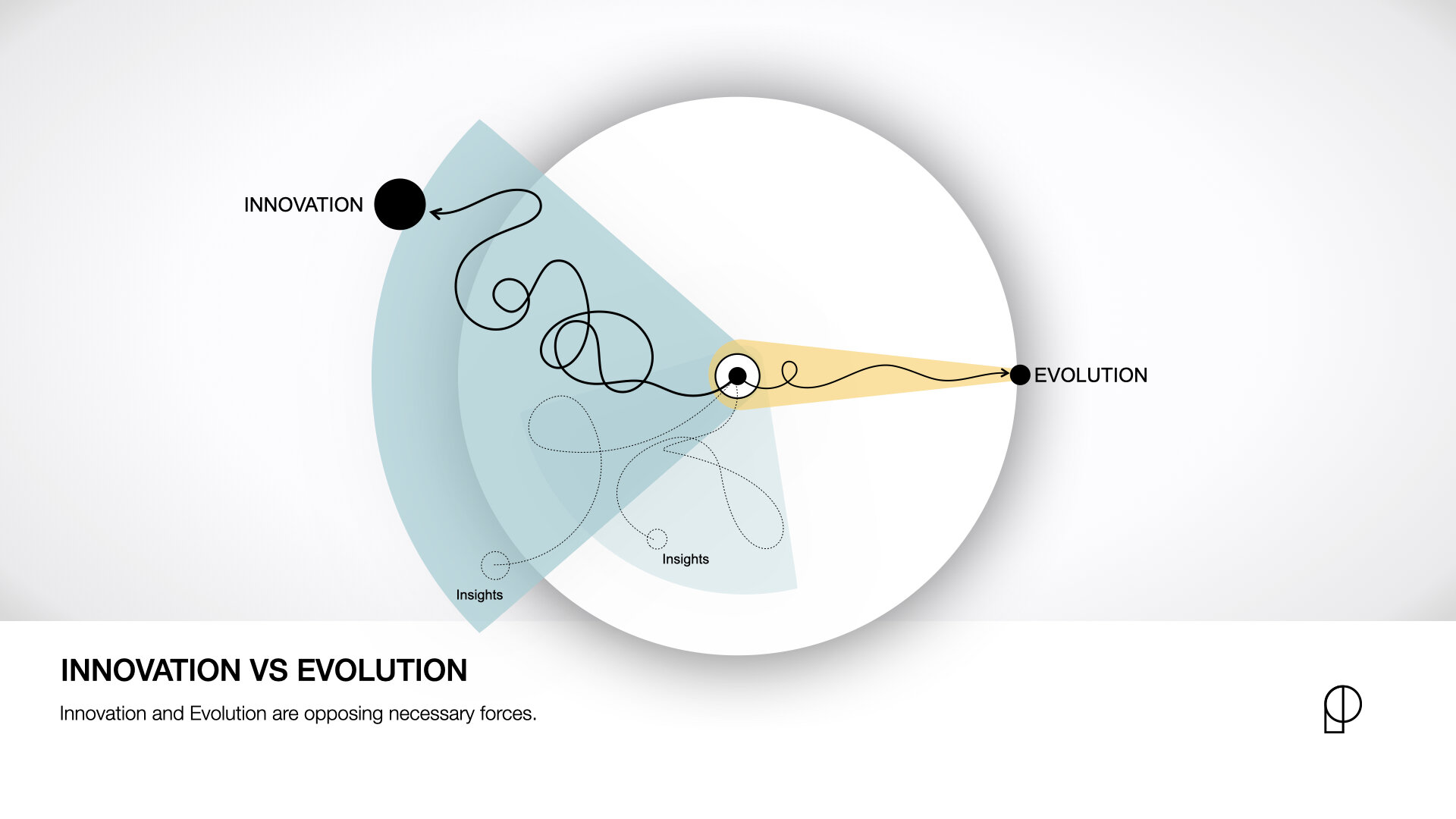
Firstly, I think this is a fantastic idea to use in a moment of influence. I often speak to designers in different situations and look to share my experiences. Ultimately I am always looking to drive curiosity by making them see the world slightly differently then the rest. The world around is not set in stone and each one of us has an opportunity to shape the future. In a recent article I wrote on Innovation (link to IDS), I express that the easiest way to find opportunities (or problems), is to the "Challenge the Norm." This conceptual design, does just that. It challenged the norm, by looking at something that has been done in one way, that no one questioned, and reinterpret it. I think it's a great concept (at least for me) to use in a moment of teachability. The core of Innovation. Read more about the Innovation Design Stack
2. Product Design Thinking
Secondly it helps bring awareness to the process we go through when we encounter new things. New constructs, new objects, new designs (digital or physical), new apps, etc. I always say, that in order to be a great designer, you need to be able not just speak design, but to read design. You need to be able to examine someone else's design, and try to understand its purpose, it's design trade-off heiracrchy, its design intent - in order to excell at the craft of design. And then ultimately to take that knowledge and apply it when designing for humans.
How can you make a great movie, if you dont understand how great movies are made, or what made the movie so great.
3. Physical / Digital Divide
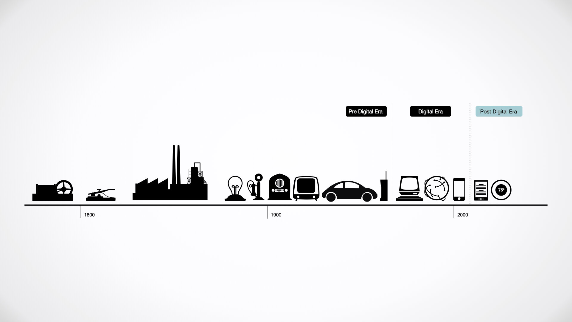
Thirdly it helps me introduce the concept of the Physical/Digital divide (remember, this is a physical manifestation of a digital concept!). As we are entering into the Post-Digital era, we need to ensure that as designers we are designing the right things, for the right purpose. We need to step back before we can move forward. Read a bit more about my point of view on this topic in "Productecture: Designing for the Post-Digital era".
